Ce site est en cours de reconstruction certains liens peuvent ne pas fonctionner ou certaines images peuvent ne pas s'afficher.
9.1. Plot
9.1.1. Curve
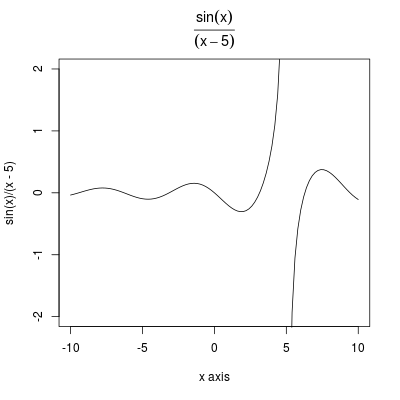
The first type of graph you can plot is a curve, for example where:
- main is the title (generally a string) but here we have chosen to render it in a more elegant maner
- ylim the limit for the y axis while the limits on the x axis are given by from and to
- xlab the label for the x axis ans also ylab for the y axis
curve(sin(x)/(x-5),from=-10,to=10, main=expression(frac(sin(x),(x-5))), ylim=c(-2,2), xlab="x axis")
9.1.2. Save as image
To save the image as a file (JPG, PNG, PDF, ...) use the corresponding command (bmp, jpeg, png, tiff, pdf), for example:
- png(filename, width = 480, height = 480, units = "px", ...)
- pdf(file, width, height, onefile, family, title, fonts, ...)
Don't forget to close the output stream using the dev.off() function to save the image.
# define data to plot
x <- c(10,20,30,40,50)
y <- c(100, 205, 297, 410, 501)
# set output to image in PNG format with given width and height in pixel
png("graph1.png", width=400, height=300)
# plot data using line and points ("b")
plot(x,y,type="b")
# or use the following command
# which means plot y in function of x
plot(y ~ x, type="b")
# save plot to file and close
dev.off()
9.1.3. Boxplot
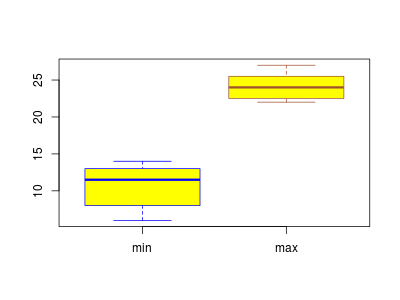
You can do some box plot as follows (see file temperatures.rt):
# read file
temperatures <- read.table("temperatures.rt", header=TRUE)
> temperatures
/*
   month minT maxT
1    jan    6   22
2    feb    8   24
3    mar    9   26
4    apr   12   27
5    mai   13   27
6    jun   14   25
7    jul   13   24
8    aug   13   24
9    sep   13   23
10   oct   11   23
11   nov    8   22
12   dec    6   22
*/
boxplot(temperatures[,2:3], col="yellow", names=c("min", "max"), border=c("blue","sienna"))
We print the minimum (minT) and maximum (maxT) temperatures and fill the boxes with yellow and use blue or sienna for the borders of the boxes.
9.1.4. Plot several data or functions
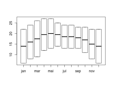
To plot several functions or data you can use plot or matplot.
# read file
> temperatures <- read.table("temperatures.rt", header=TRUE)
> temperatures
/*
   month minT maxT
1    jan    6   22
2    feb    8   24
3    mar    9   26
4    apr   12   27
5    mai   13   27
6    jun   14   25
7    jul   13   24
8    aug   13   24
9    sep   13   23
10   oct   11   23
11   nov    8   22
12   dec    6   22
*/
# here month must be converted into a factor with corresponding
# level otherwise the temperatures will be printed following the
# lexicographic (alphabetical) order of the months
> temperatures$month
 [1] jan feb mar apr mai jun jul aug sep oct nov dec
Levels: apr aug dec feb jan jul jun mai mar nov oct sep
# so transform months
> temperatures$month = factor(temperatures$month , levels=temperatures$month)
> temperatures$month
 [1] jan feb mar apr mai jun jul aug sep oct nov dec
Levels: jan feb mar apr mai jun jul aug sep oct nov dec
# then plot minimum and maximum temperatures
plot(temperatures$month, cbind(temperatures$minT,temperatures$maxT))
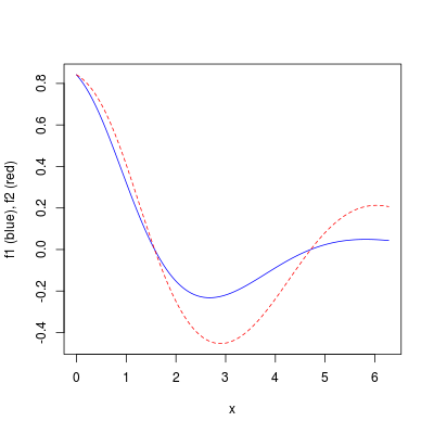
> f1<-function(x) sin(cos(x)*exp(-x/2))
> f2<-function(x) sin(cos(x)*exp(-x/4))
> x<-seq(0,2*pi,0.01)
> matplot(x,cbind(f1(x),f2(x)),type="l",col=c("blue","red"),ylab="f1 (blue), f2 (red)")
9.1.5. barplot
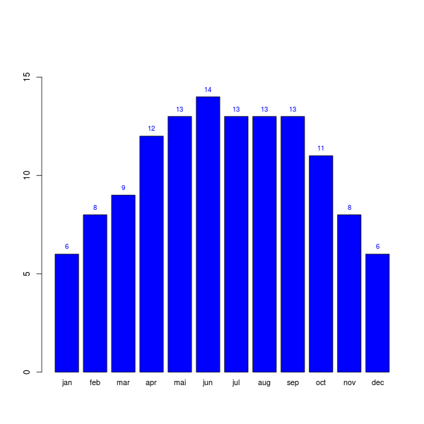
To plot temperatures as an histogram, called here a barplot, use the following commands:
# read data
temp <- read.table("temperatures.rt", header = TRUE)
# convert months as factor
temp$month = factor(temp$month, levels = temp$month)

# increase ylim in order to have the highest value visible
ylim_adjusted <- c(0, 1.2*max(temp$minT))

# start plot with minimum temperatures
pl <- barplot(temp$minT, col="blue", ylim = ylim_adjusted)
# add temperatures over each bar
text(x = pl, y = temp$minT, label = temp$minT, pos=3, col="blue", cex=0.8)
# add months on the x axis
axis(1, at=pl, labels=factor(temp$month), tick=FALSE, las=1, line=-0.5, cex.axis=0.9)
For text():
- pos is position specifier, values of ‘1’, ‘2’, ‘3’ and ‘4’, respectively indicate positions below, to the left of, above and to the right
- cex is a numeric character expansion factor; multiplied by par("cex") yields the final character size
For axis():
- las is the orientation of the label '1' for horizontal and '2' for vertical
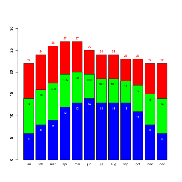
Here is another example where we plot the maximum, average and minimum temperatures on the same graph:
# read data
temp <- read.table("temperatures.rt", header = TRUE)
# convert months as factor
temp$month = factor(temp$month, levels = temp$month)

# compute average temperatures
avgT = (temp$minT + temp$maxT) / 2

# increase ylim in order to have the highest value visible
ylim_adjusted <- c(0, 1.2*max(t$maxT))

# plot maximum temperatures
plmax <- barplot(temp$maxT, col="red", ylim = ylim_adjusted)
# add temperature value over each bar
text(x = plmax, y = temp$maxT, label = temp$maxT, pos=3, col="red", cex=0.8)

par(new = TRUE)

# plot average temperatures
plavg <- barplot(avgT, col="green", ylim = ylim_adjusted)
# add temperature value over each bar
text(x = plavg, y = avgT-2, label = avgT, pos=3, col="black", cex=0.8)

par(new = TRUE)

# plot minimum temperatures
plmin <- barplot(temp$minT, col="blue", ylim = ylim_adjusted)
# add temperature value over each bar
text(x = plmin, y = temp$minT-2, label = temp$minT, pos=3, col="white", cex=0.8)

# add months on the x axis
axis(1, at=plmin, labels=factor(temp$month), tick=FALSE, las=1, line=-0.5, cex.axis=0.9)
9.1.6. ggplot2
ggplot2 is a plotting system for R, based on the grammar of graphics, which tries to take the good parts of base and lattice graphics and none of the bad parts. It takes care of many of the fiddly details that make plotting a hassle (like drawing legends) as well as providing a powerful model of graphics that makes it easy to produce complex multi-layered graphics.
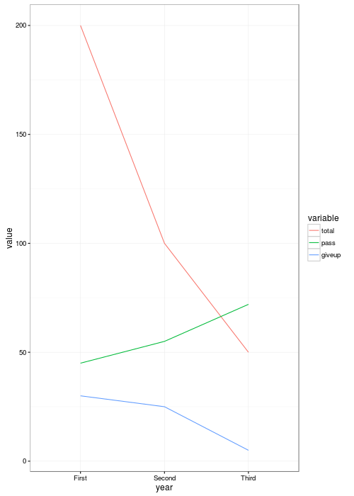
9.1.6.a first method: tranform your data
If you want to plot data with ggplot2 you need to transform them from long to wide data. In fact ggplot2 will create beautiful graphics but in order to obtain them you need to transform your data in a non trivial process.
So imagine you have data about students that look like this:
| year | total | pass(%) | giveup(%) |
|---|---|---|---|
| First | 200 | 45 | 30 |
| Second | 100 | 55 | 25 |
| Third | 50 | 72 | 5 |
then you will need to transform the data into:
> melt(students, id=c("year"))
/*
    year variable value
1  First    total   200
2 Second    total   100
3  Third    total    50
4  First     pass    45
5 Second     pass    55
6  Third     pass    72
7  First   giveup    30
8 Second   giveup    25
9  Third   giveup     5
*/
So from a table of 3 rows and 4 columns, if you consider that the first columns is the differentiation criterion, then you obtain a table of $3 × (4-1)$ rows of $(4 - 1)$ columns.
In order to transform the data you can use the gather() or melt() functions.
library(ggplot2)
library(tidyr)
library(reshape2)

# definition of students by year and for each year
# total number of students and percentage of students
# who pass to the next grade and
students <- data.frame(
  year=c("First", "Second", "Third"),
  total=c(200,100,50),
  pass=c(45,55,72),
  giveup=c(30,25,5)
)

# transform into wide data
students.wd = melt(students, id=c("year"))

# plot data
png("students1.png", width=400, height=500)
p <- ggplot(students.wd, aes(x=year, y=value, group=variable, colour=variable))
 geom_line(size=2) +
 theme_bw()

dev.off()
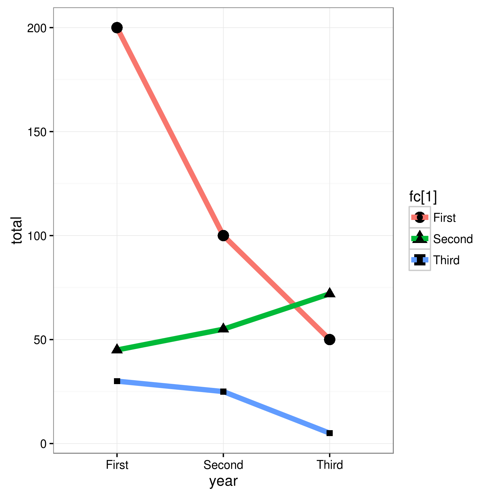
9.1.7. second method: DON'T tranform your data
Warning: Undefined variable $year in /home/jeanmichel.richer/public_html/r_plot.php on line 376
library(ggplot2)

# definition of students by year and for each year
# total number of students and percentage of students
# who pass to the next grade and
students <- data.frame(
  year=c("First", "Second", "Third"),
  total=c(200,100,50),
  pass=c(45,55,72),
  giveup=c(30,25,5)
)
fc  = factor(students)

# plot data

g <- ggplot(students)
g <- g + geom_line(aes(x=year, y=total, group=1, colour=fc[1]), size=2)
g <- g + geom_point(aes(x=year, y=total, group=1, shape=fc[1]), size=4)
g <- g + geom_line(aes(x=year, y=pass, group=1, colour=fc[2]), size=2)
g <- g + geom_point(aes(x=year, y=pass, group=1, shape=fc[2]), size=3)
g <- g + geom_line(aes(x=year, y=giveup, group=1, colour=fc[3]), size=2)
g <- g + geom_point(aes(x=year, y=giveup, group=1, shape=fc[3]), size=2)
g <- g + theme_bw()
g

ggsave("students2.png", scale=0.8)